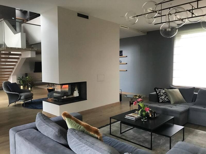
Color has the power to transform a space not just aesthetically but emotionally as well. In Primrose Hill, known for its picturesque views and chic urban lifestyle, interior design transcends mere decoration; it creates atmospheres. The residents here understand the influence of a well-chosen palette. Let’s delve into how experts in interior design in Primrose Hill apply color theory to pick the perfect colors for any space.
The Psychology of Color
Emotional Influence
Before touching a color wheel, designers think about the mood and emotions a room should evoke. Each color has psychological values associated with it—blues are calming and serene, reds are passionate and energizing, yellows are cheerful and inviting, and greens are balanced and revitalizing. The desired emotional response often dictates the foundational hue for a room.
Functional Fit
Beyond feelings, functionality plays a pivotal role in color choice. For instance, vibrant colors might energize a home office or workout space, while softer tones might be better suited for a bedroom where relaxation is key.
Understanding the Color Wheel
Primary, Secondary, and Tertiary Colors
Armed with an understanding of color psychology, designers use the color wheel to fine-tune their palette. The color wheel contains primary, secondary, and tertiary colors. Combinations of these create schemes that are pleasing to the eye and suit design objectives.
Color Harmony
Designers aim for harmony when selecting colors. Complementary colors (opposite each other on the wheel), analogous colors (next to each other), and triadic (evenly spaced around the wheel) are common schemes. The choice depends on the desired balance and contrast within the space.
Lighting and Color Perception
Natural vs. Artificial Lighting
Lighting dramatically affects how colors are perceived in a room. Interior designers consider the source and amount of light a room receives. In places like Primrose Hill, where natural light might flood a room during the day, reflective lighter colors can maximize brightness, while darker tones might be used to draw in the spaciousness and coziness.
Color Temperature
Colors have temperatures — warm or cool — and these can either complement or contrast with the light. Warm colors can make large, cold spaces feel more intimate, while cool colors can make smaller rooms feel more open and airy.
Material Considerations
Texture and Finish
The texture and finish of materials can also impact color choices. Glossy finishes reflect more light and can make colors appear brighter and more vivid, while matte finishes absorb light, giving colors a more subdued look.
Real-World Application
Case Studies
Interior designers often use specific projects as examples to illustrate successful applications of color theory. For instance, a case study of a recent loft conversion in Primrose Hill might show how a bold accent wall in burnt orange against muted grays brought warmth and energy to a modern living space, influencing mood and perceived temperature.
Client Collaboration
Ultimately, the perfect palette is a collaborative decision. Designers bring their expertise, but the personal tastes and preferences of the client play a crucial role. It’s a dialogue, guided by professional knowledge but refined by personal connection and intuition.
Conclusion: The Power of Color
Choosing the right color palette is both an art and a science. Interior designers combine psychological insights, design principles, and technical considerations with their intuitive sense and client desires to transform spaces profoundly. In stylish areas like Primrose Hill, where design is paramount, the right colors not only decorate a space but enhance and transform lives. Whether you’re considering a bold renovation or a subtle refresh, understanding the basics of color theory can help you see your space in a new light.


